Steven Dunbar is a Bay Area transit engineer, activist, and now member of the Livermore County Planning Commission. Dunbar has a driving enthusiasm for transit and its ability to create opportunity and support communities, so after years of influencing local transit policy as a private citizen — attending planning meetings, collaborating with local government officials, and joining transit-oriented non-profit groups — he decided to run for the BART Board of Directors in the November 2020 election. He already had a strong network of support from the community and local government, but with limited time, a firmly established incumbent, and no ability to buy advertising, it was not going to be an easy race.
I served as Dunbar’s one-person marketing team, directing and producing a new brand, a bespoke website, and social media content for his campaign.

Challenging Circumstances
I was brought on to the campaign in August 2020, less than 3 months from election day. This was an incredibly short timeline for any major project, let alone a campaign that needed a brand, a website, and all accompanying communications.
Dunbar’s opponent in the race was a firmly established incumbent who had held the seat for over a decade. Unseating incumbents is always an uphill battle, especially when the challenger is a newcomer with little name recognition.
Most crucially, an error from the state election office meant that Dunbar could not buy advertising. No social media ads, no mailers, no yard signs, no billboards; his campaign communications rested entirely upon his website and social media presence.
With all of these factors working against him, Dunbar’s campaign should have gone nowhere. Instead, he came within 3% of winning.
Finding Solutions
The tight timeline forced us to focus on the campaign messaging and distill it down to its simplest, most effective form. The website had to be brief, but not skimpy; the writing had to be direct, but not harsh; and the brand had to exude competence, but retain personality.
While the opponent did have the advantage of incumbency, he had also become complacent. His website was years out of date, he had no social media presence of note, and most importantly, he no longer kept up active communication with constituents. Here, Dunbar and I found our strategy: we were going to out-communicate his opponent, not only through a superior website and social media presence, but by demonstrating a commitment to open communication with the community.

Branding
The challenge for any newcomer candidate is credibility. If things are mostly fine under the incumbent, why trust a previously unknown person to be better? Dunbar and I knew that our key to conquering the credibility gap would come from the campaign’s brand. We quickly homed in on a simple but effective brand system that confidently communicated expertise, solidity, and competence, while remaining approachable and friendly. Our essential creative statement was “bureaucracy, but make it fun.”
A perfect balance of banality and personality
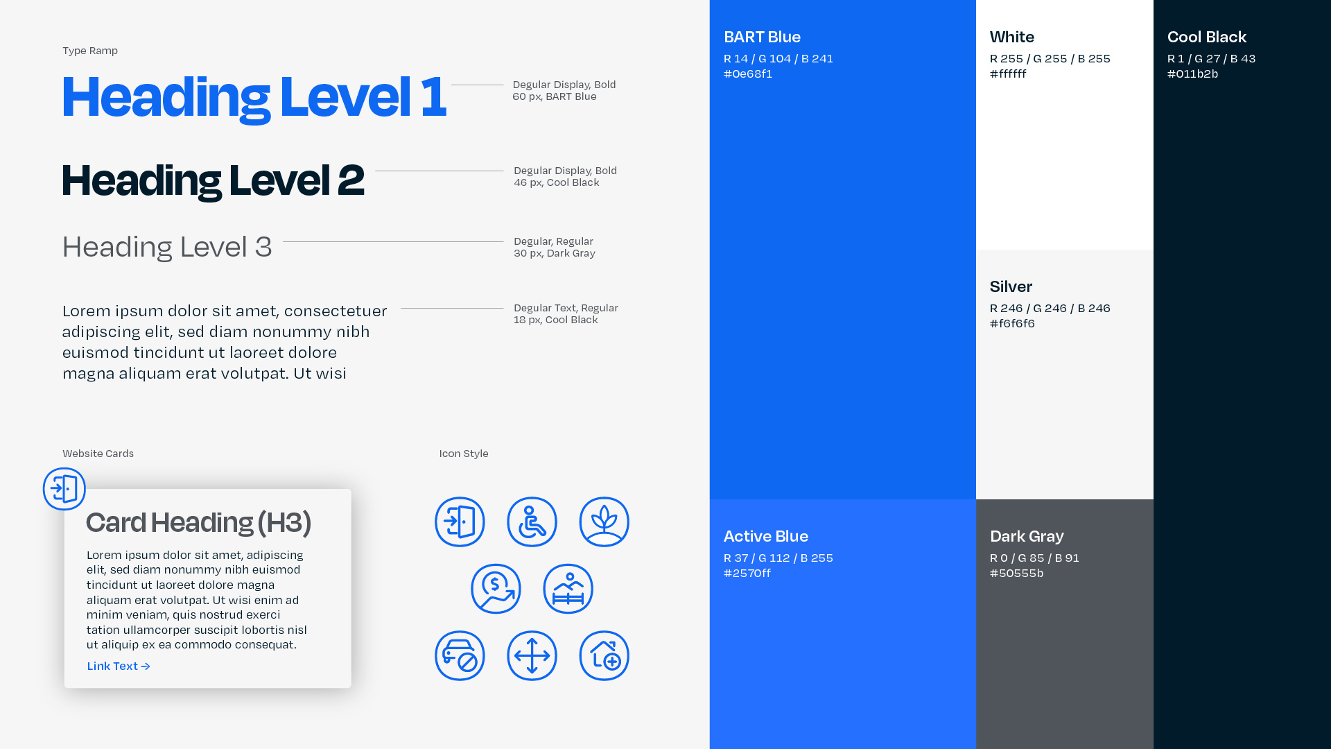
With such a limited development schedule, there was no time to produce original imagery or other brand assets, so we relied on typography and color to carry the visual voice of the campaign. Oh No Type’s Degular was a shoe-in, striking our perfect balance of banality and personality. The color palette wears its BART inspiration on its sleeve, but with a much brighter blue to provide a needed hit of energy and visual draw. Rigid layouts with generous white space create a sense of structure and reliability, while rounded icons help contrast with the sharp text.

Website
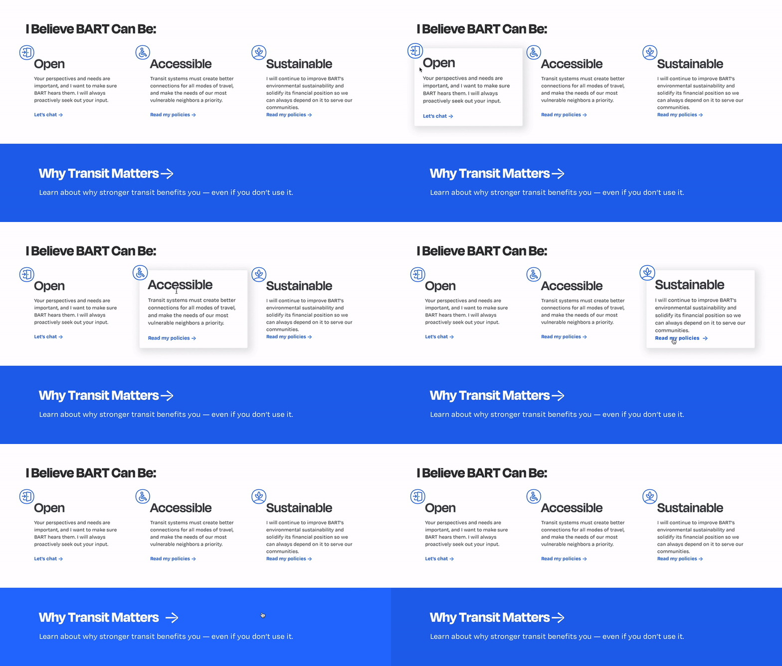
Without ability to buy advertising, we knew the website needed to carry the weight of the campaign. Given our Bay Area audience and the opponent’s more run-of-the-mill web presence, we saw an opportunity for differentiation: instead of trying to look like another municipal campaign website, we took inspiration from tech and startup sites, with their clean layouts, ample white space, subtle interactive elements, and punchy copy organized into clear sections. The homepage specifically is modeled on tech product landing pages, showing most of the campaign’s messaging and content in a single scrolling page, and offering multiple prompts for users to explore more deeply or connect with the campaign. Our aim was not only to set ourselves apart from the opponent, but also to ride the coattails of tech's Bay Area ubiquity.
I built the site in Webflow, and it is completely bespoke. While other website platforms like Wix or SquareSpace might have been faster, none of them offered all of the features or flexibility that we were looking for, and with such limited but specific needs, a template would have been cumbersome to find and work with, so we started from scratch. With a lot of focus and determination, we took the site from a blank page to fully launched in about five weeks.
The Result
In the end, Dunbar did not win the seat, but I would be hard pressed to call the campaign a loss. To start the race as a completely unknown candidate, challenging an established opponent and lacking any ability to advertise, and end the race with over 57,000 votes, just 2.6% away from the winner, that's impressive from any angle. It's impossible to say how much of the final result can be attributed to Dunbar's passion and perseverance on the campaign trail and how much is due to the campaign's web presence, but with 10,000 page hits in the month between launching and election week, the site certainly contributed.
